by Erinne Paisley
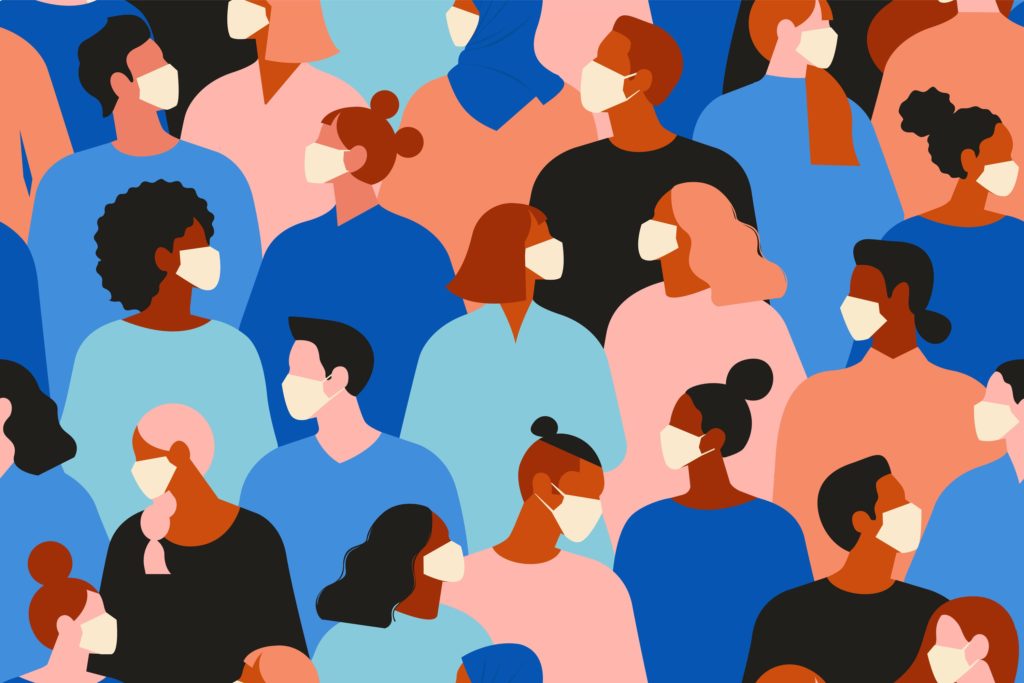
During the COVID-19 global pandemic, we have all had to make signification adjustments to our daily lives. One of these is reading more news. This news contains an endless stream of data and it has been up to government bodies, health organizations, and journalists to sort through this data and create visuals for us to understand it.
These visualizations are critical for us to sort through the constant noise of data that the pandemic has created. COVID-19 has created a trend of data visualizing. However, like any other form of data visualizations, COVID-19 images such as “flatten the curve” are not completely objective. Data visualizations make visible certain perspectives and experiences, empowering and disempowering certain demographics. In the case of womxn, especially womxn of colour, historically these experiences have not been included. “Womxn” is used as an alternative to the English word “women” to include non-cisgender women.
A 2016 analysis of the Ebola and Zika global health emergencies explains: ‘The combination of pre-existing biological and socio-cultural factors means that while the health status of populations as a whole deteriorates during complex humanitarian crisis, women and children are especially vulnerable.’
D’Ignazio and Klein offer the term “feminist data visualizations” to describe those data visualizations that make visible women’s perspectives and experiences – and empower through this. Feminist data visualization is still not the mainstream way of sorting and presenting data. When it comes to data handling surrounding the COVID-19 pandemic, in March 2020 Wenham et al. explained that they:“are not aware of any gender analysis of the outbreak by global health institutions or governments in affected countries or in preparedness phases”.
As of early April 2020, many non-profits such as Plan International as well as academic think tanks like the Centre for Feminist Foreign Policy have begun to offer support for womxn’s rights during the COVID-19 pandemic. Journalists, such as Helen Lewis of The Atlantic with her popular article “The Coronavirus Is a Disaster for Feminism”, have also highlighted the experience of womxn. However, the lack of feminist data visualizations is evident.
To encourage and explore the importance of feminist data visualizations amidst the COVID-19 pandemic, I will look to two examples of female perspectives and experiences during this time, exploring specifically the pandemic’s impact on increased rates of domestic violence and decreased rates of global female education. I will also zoom in on examples of past feminist data visualizations of these two topics that could be used as jumping off points for health institutions and governments to conduct similar work during COVID-19.
Increased Rates of Domestic Violence
Domestic violence, also referred to as “intimate partner violence (IPV)”, is a “pattern of behaviors used by one partner to maintain power and control over another partner in an intimate relationship”. Domestic violence is the most prevalent type of violence against womxn and, because of this, has been categorized by many scholars as a “global pandemic” of its own. According to the World Health Organization (WHO), 1 in 3 women around the world have experienced physical or sexual intimate partner violence.
This global public health problem has historically been unaddressed. This is because the “home” was regarded as “private” until the second wave of the feminist movement in the 1960s and ‘70s. During this feminist wave, slogans like “the personal is political”, created by Carol Hanisch, encouraged accountability for womxn’s rights both in the public and private realm. This included addressing issues such as the allocation of duties within the household, domestic violence, as well as other social and legal rights within womxn’s “private” lives.

During widespread public emergencies in the past, there has been a clear association between these events and rising rates of domestic abuse. For instance, after the New Zealand “Canterbury” earthquake in 2010, there was recorded 53% rise in domestic violence. Following Hurricane Katrina in the United States, there was also a near doubling in domestic violence rates in the affected areas.
Existing Feminist Data Visualization’s of Domestic Violence
In 2009, researchers at Harvard University created a computer model that automatically detects at-risk patients for domestic abuse. This program sorts through huge amounts of medical data from U.S. hospital emergency visits and creates data visualizations referred to as “risk gel” visuals for physicians to view. The bars are the patient’s medical history, specifically visits to a medical practitioner, colour coded based on the historical association of these injuries to domestic abuse.
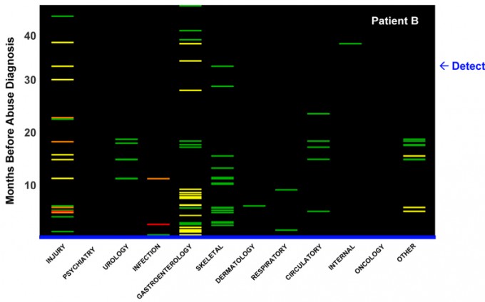
This visualization of data allows for further prevention and attention to cases of domestic abuse by physicians. It is a form of feminist data visualization as it challenges the binary of one single visit to a doctor being marked as evidence of domestic abuse or not and instead tracks multiple visits on a scale of injury to create more narrative evidence of this abuse. This example of feminist data visualization may not be something that can be used directly to identify those at-risk of increased domestic violence cases during COVID-19 quarantining, but it serves as a strong example of how feminist data visualizations can reveal hidden narratives within existing data and support womxn’s rights.
At-Home Education Effect on Womxn
Most data visualizations of the COVID-19 pandemic mark the end of its effects as the eradication of the virus itself. Although this will be a significant turning point in the pandemic’s trajectory, from a feminist perspective this is in no way where the effects of the virus end – instead, where they begin.
As of April 2020, over 91 percent of the worlds student population has had to stay home from school (UNESCO 2020). Following historical trends, the role of educating children in the home will fall on a majority womxn. Traditionally, womxn are still those who worldwide take the societal principle responsibility for children. This increased responsibility in the home may lead to detrimental effects for womxn’s own careers once pandemic-related quarantine has ended as male counterparts will have advanced further during the quarantine period due to less homeschool responsibilities.
Female children around the world face additional barriers to their educational, and eventually professional, progressions. Feminist data studies on the 2014 Ebola epidemic found that womxn still often have less decision-making power than men which results in less female students returning to school once the institutions are re-opened. Global studies have also shown that the longer a child is out of school the more likely they are to not return.
One of the main reasons for girl’s not returning to school is the increased rate of unwanted and transactional sex. A study by the United Nations Development Programme on the Ebola epidemic showed that teenage pregnancies in some communities of Sierra Leone went up by 65 percent because of school closures and increased sexual assault at home.
Feminist Data Visualization: Female Education Rates
In 2018, a number of American researchers experimented with data visualization as part of the annual February celebration of Black History. This challenge to “#VisualizeDiversity” resulted in a feminist data visualization submitted to the project by a researcher named “Sharon”, in 2018. The visualization took the data from the United States’ Department of Education fourth grade basic reading skills and re-organized the data.
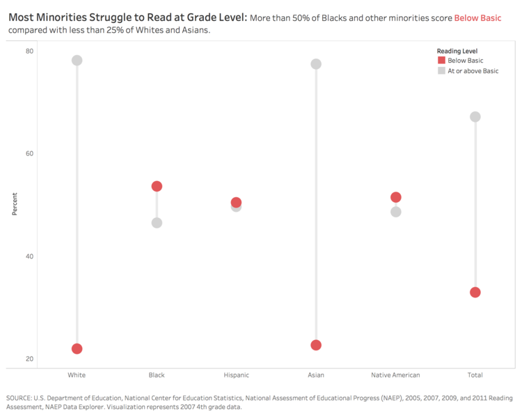
The presentation of the data above shows a hidden narrative, that most minorities in America struggle to read at grade level and, more broadly, that there are systemic barriers that prevent these minorities from excelling in this way. This data visualization shows the potential of feminist data visualizations to reveal a narrative that the initial sorting of data may not have focused on. By re-sorting the data to focus on minority status, the data now goes beyond the categories of “literate” and “illiterate” and begins to show the multiplicity of reasons for these literacy levels. As well, the data visualization now acknowledges the historical exclusion of these marginalized groups in traditional hierarchical power structures.
Conclusions
The COVID-19 global pandemic has led to a larger consumption of data visualizations. It is clear that data visualizations are needed not just for an understanding of the crisis at hand, but as instructions for what actions are the most crucial to take. The most viral data visualizations attached to the pandemic to date have focused on the spread of the virus itself – including images such as the “Flatten the Curve” and its accompanying #stayhome social media campaign. We must continue to question the objectivity of these viral data visualizations asking questions such as: When the curve ends – is this really the end of the pandemic’s impact? Is #stayhome really helping everyone stay safe?
So far, viral COVID-19 pandemic data visualizations have focused on a narrow perspective and largely exclude the experience and risks for womxn around the world. However, this also creates an opportunity for feminist data visualizations to rise in popularity. The world is watching for data visualizations, asking how to help, and supporting one another. It’s time to include womxn in this.
If you, or a womxn you know, are in need of immediate support during the COVID-19 pandemic, please consult the list of resources across Europe on the Women Lobby website.
About the author
Erinne Paisley is a current Research Media Masters student at the University of Amsterdam and completed her BA at the University of Toronto in Peace, Conflict and Justice & Book and Media Studies. She is the author of three books on social media activism for youth with Orca Book Publishing.